What is Component Based Design?
As web design has evolved over the years, there has been a shift from simply designing web pages to creating full design systems. Design systems make it much easier and more efficient to create multiple digital products that are unified under one visual brand language.
Component based design is a spin off of Atomic Design, which was pioneered by Brad Frost. The basic concept is that, when designing a website, application, or any other product, we break up the UI into small, reusable parts, and then use those parts to build pages, screens, etc. So, instead of designing from the page level down to the individual elements, we design individual elements and work our way up to the page level.
Component Based Design can be split up into six categories, each of which builds upon the next. Using this concept, we define our smallest parts and use those to build larger components, and those then build our pages.
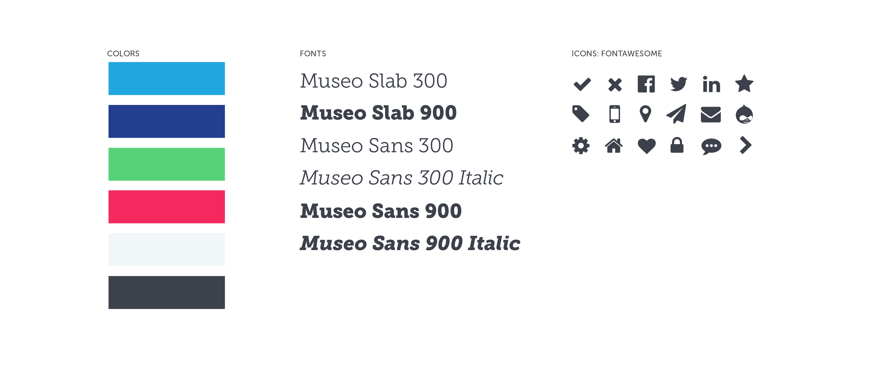
1. Branding/Identity
Branding/Identity refers to the core elements that make up the brand of the project, company, etc. Common examples of items we would define at the branding level would be colors, fonts, and icons. These are the most basic styles that give the brand its unique personality.
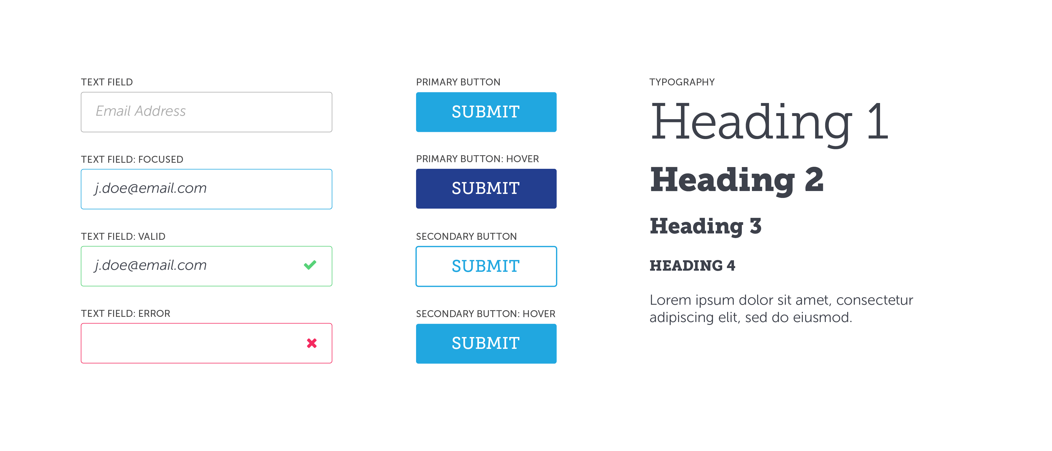
2. Elements
Elements are the project's smallest reusable parts. Think HTML elements: links, headers, paragraphs, buttons, inputs, dropdowns, etc. We use our pre-defined branding styles (colors, fonts, etc.) to design our elements.
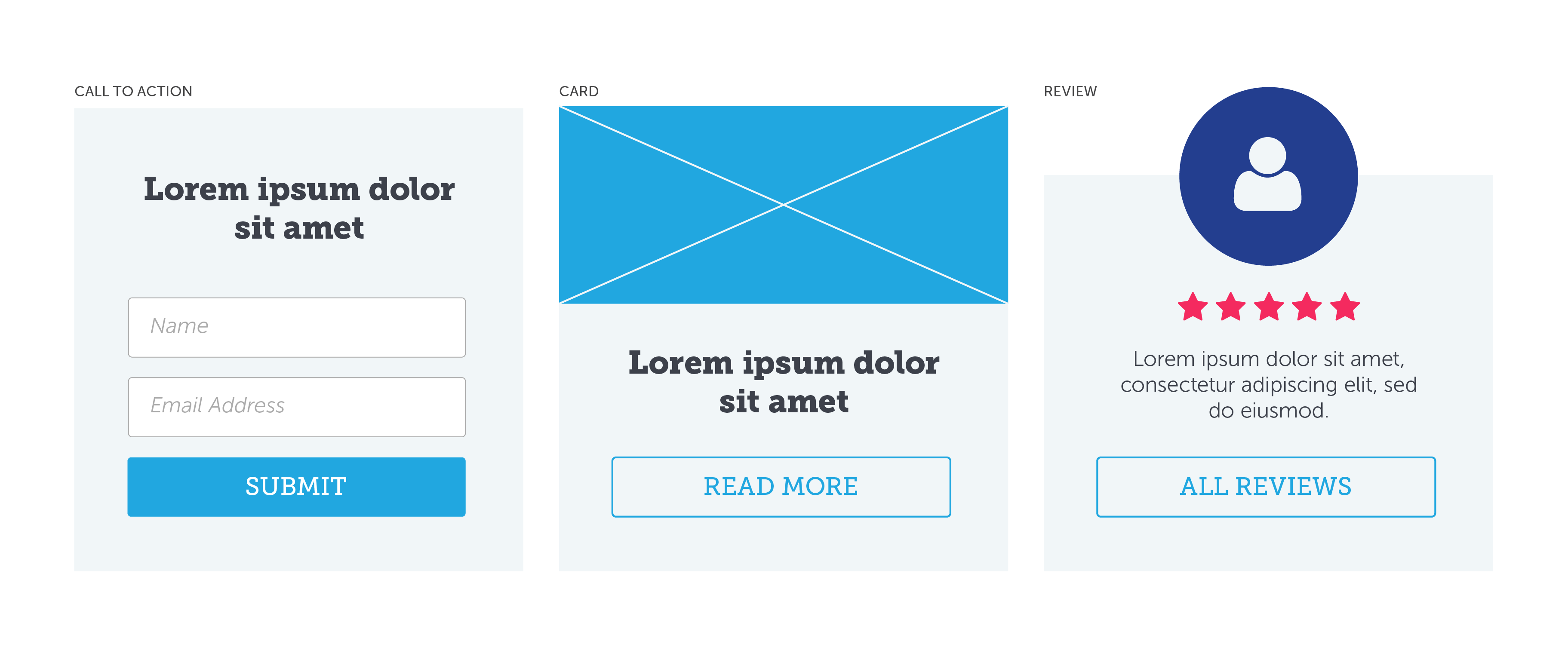
3. Components
Components are composed of two or more elements. Common examples of components could be cards (a combination of text and buttons) and forms (a combination of inputs and buttons).
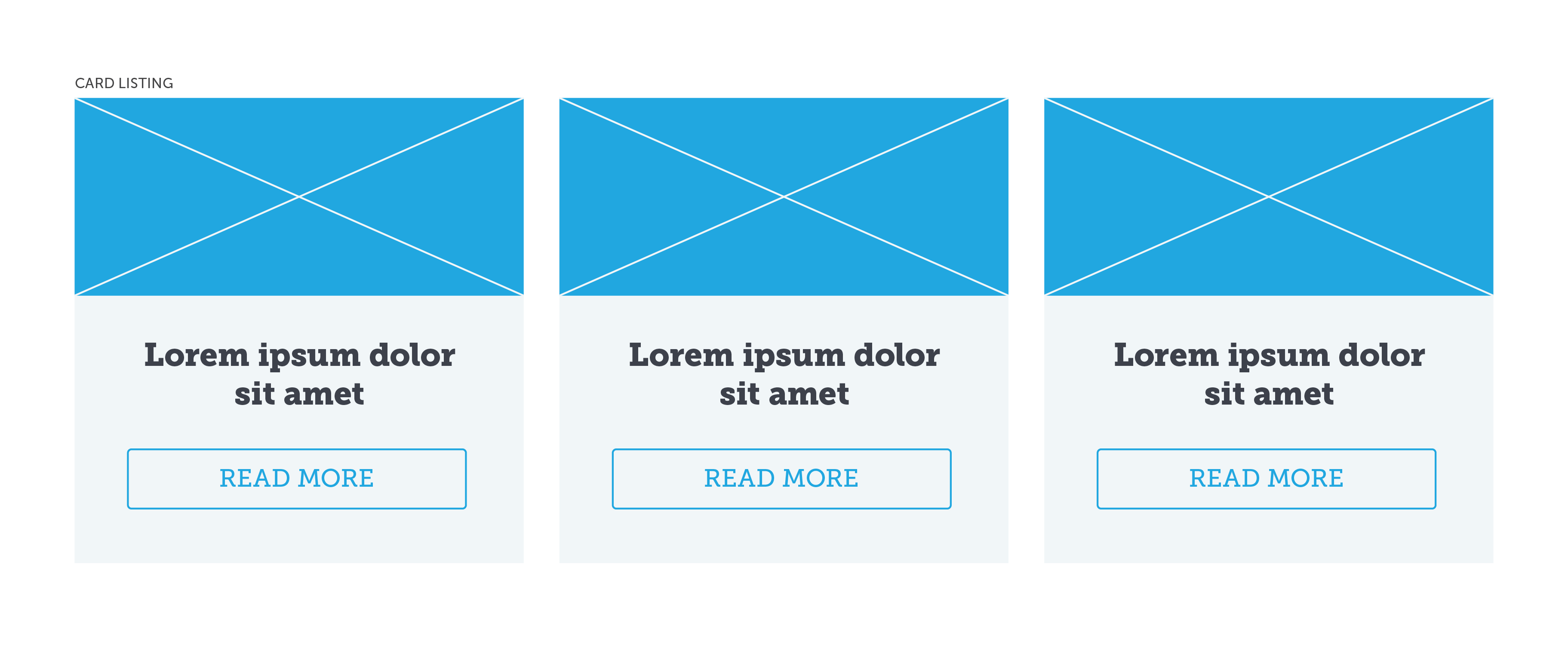
4. Templates
Much like how components are a combination of two or more elements, templates are a combination of two or more components. Their purpose is to show how multiple components will interact with one another.
5. Layouts
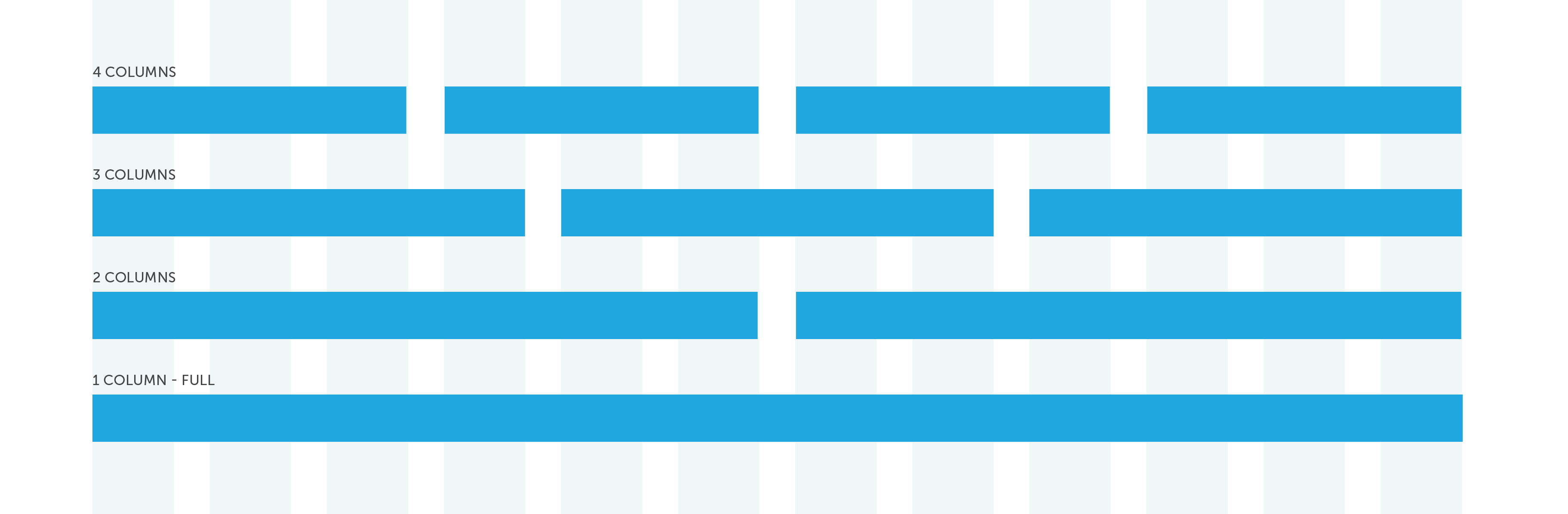
This is where allowed layouts, grids, and spacing are defined. Defining these up front makes it easy for new designers or developers to jump into a project and use pre-defined styles and guidelines.
6. Pages
Pages refer to how templates, components, elements, etc. all interact with one another within the bigger picture. Any one-off decisions are made at this level (the home page of a website is a common example).
Benefits of Component Based Design
Consistency
Since elements are already pre-defined, a new designer can easily jump into a new project and create new products that are consistent with the brand's identity.
Efficiency
Design and development efficiency is improved because most of the work of designing and developing new products has been done up front, eliminating any extra work in duplicating something that has already been done before.
Scalability
Again, since we have a pre-defined library of elements, new products, web pages, content, etc. can easily be created by simply using what's already there to scale your product.
Cons of component based design
Responsiveness
Design-wise, responsive behavior for components can easily be pre-defined. In terms of development, however, components themselves can never truly be responsive, since there is no way, in native CSS, to change styles based on the width of a component. We only have the browser width to work with. This means that components need to be made responsive based on their position relative to the browser, which makes responsive behavior a bit trickier.
How can we use these concepts in Drupal themes?
Luckily, Drupal makes it fairly easy to implement component based design practices within theme development. Anyone who has ever tried to style a one-off page in a Drupal theme knows that it's often not a very easy thing to do, and can end up feeling a bit "hacky" or unstable.
Organizing your theme
Something that has helped me a lot in developing custom Drupal themes is organizing my css (or sass) files into folders that correspond to these categories, and then placing files in the appropriate folders. I then import all of those partials into a master file, which is the file that Drupal then uses.
Drupal Theme Folder Structure & Contents
- 01-identity => Sass variables & mixins
- 02-elements => Typography, inputs, links, buttons, tables, etc.
- 03-components => Blocks, node teasers, forms, etc.
- 04-templates => Regions, views, etc.
- 05-layouts => Allowed layouts
- 06-pages => Front page, node pages, view pages
Separating your files this way reinforces the concept of defining smaller, reusable pieces first, and then using these styles to build upon more complex and more specific components and pages. It will help you pinpoint exactly where to change or fix styles that are broken or incomplete.
This may not work or make the most sense to everyone, but it has something that has personally helped make my themes easier to understand.
Conclusion
Component based design is becoming more and more common as design continues to evolve. Although there tends to be a bit more work up front when implementing a new product, it can dramatically improve design and development efficiency in the long run.
About the Author
Haley Troyer

Haley is a user experience designer and front end developer who enjoys crafting beautiful and usable web and mobile experiences.