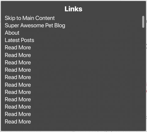
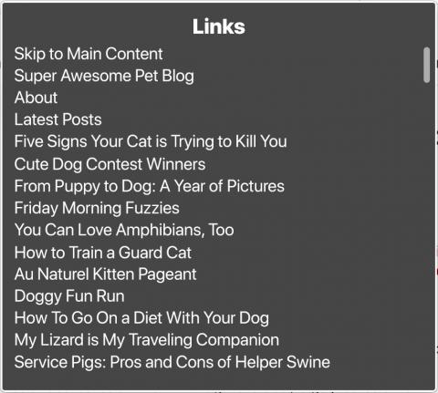
Do you see how useless the first links menu is? Other than the main navigation, there’s no way to know what in the world you’re supposed to be reading more of. The second example uses blog article links as the title, which gives people a lot more information about the content they can expect to access on click. In addition, links that are vague but entice people to do things such as “Buy Now” even trigger anxiety for some.
Let people know if they’re going to be leaving your site
Let me just say that, while this aspect of links isn’t necessarily part of being a CMS admin, it very well could be. It just depends on how the CMS determines the designation of an external link. Is there automatic detection (and subsequent styling) in place to account for external links? Or is it something that you as the admin need to determine as you go and add the appropriate style classes? If it’s the former, I suppose you could skip this section (even though you’re missing out on some quality education). However, if you have to handle the display of internal external links on your own, or worse yet, wondering what the heck I’m talking about, please read on.
Have you ever had that jarring experience when you click a link thinking you’re going to stay on the same website only to find yourself on a page where everything looks different and no way to get back where you were without the assistance of browser controls? That can be even more frustrating for people with low vision or cognitive disabilities. A common trend to handle external links is to simply have them open in new tab or window. While this isn’t necessarily bad, it’s not sufficient by itself as a way to show that a link is external.
If a link is going to take a person to another website, the link should visually and programmatically inform the user. The link title should come first in these cases, so the unique identifier is what is read first by screen readers. This helps people navigate more quickly through links, instead of having to listen to something like “Link. Opens in new window: Ten Best Shampoo Brands for Puppies…Link. Opens in new window: Tips for Walking your Cat on a Leash.”
There are a variety of ways to handle the visual representation of an external link. One way is to use the external link icon after the link text ([FA external link icon here]) let sighted users know that a link will navigate away from the site with an aria-label that reads “Opens in new window.” Michigan State University, for example, does not use an icon, but on hover or focus reveals the Opens in new window text.
Hey, that link should be a button!
As a content admin, it's highly unlikely you'll run across this issue when managing your site's content. However, there are other areas in your site that may use links when they should actually be buttons. When should that be the case, may you ask? Links should be buttons when they trigger an action instead of taking you to a webpage (or a point on a webpage). Possible areas where this may be the case is mobile menu open and close toggles, links that trigger a popup window, etc. Now, I don't mean it has to look like a button. But semantically, these should be using the <button> element instead of <a>. If you spot areas on your website that you believe are violating this rule, you should talk to your web developer about resolving the issue.
Tips for accessible links
So what makes for an optimal link? Following these guidelines should help make sure any links you add or configure are accessible.
Dos of accessible links:
- Craft clear, succinct link text. Long alternative text slows down screen reader users, which results in a negative experience. Use as few words as possible to accurately describe your image’s content and/or function. If your link is in the context of a sentence read it thoroughly to see how many words you can leave out of the link itself for the link to still make sense if it were accessed out of context (ex. in the sentence, “Feel free to contact us if you have any additional questions,” the link would be “contact us.”)
- Avoid using the URL itself as link text. To be clear, not all URLs are bad, but a good rule of thumb is to only use the URL if it is short and easy to read, such as the site's homepage link. URLs that use strings of letters or numbers are not only long in length, but offer no value to your readers. A good test is to read the link aloud. Does it sound like gibberish to you? If so, you can be sure it will sound like gibberish to screen reader users.
Don’ts of accessible links:
- Don’t prefix your alt text with “Link to,” “Click here to,” etc. Visual link styles are sufficient to indicate a link to people with good vision, and assistive technology will announce that the focused element is a link. Adding “link to” text or something similar is redundant and slows people down that are using assistive technology
- Don’t use vague phrases. Links that say “Click here,” “Buy now,” or “More,” Tell assistive technology users absolutely nothing. They trigger anxiety in many people as well, since they don’t know exactly what the context of the link is, even those without the need of assistive technology.
Configuring links in your CMS system
Like images, there’s usually only a couple of ways you’ll have control over link text in your CMS system: link fields and WYSIWYG fields.
Here’s some helpful articles about links:
Next week, we’ll talk about WYSIWYG fields and how to format our content using best practices!


