Adding user-selectable Font Awesome icons to components

Front-end Development
Drupal

Font Awesome icons are a fun way to add visual appeal and definition to interactive or informational elements on your website. In this article, we’ll be covering how to utilize the Paragraphs module, List (text) fields, and Drupal’s flexible Twig templates on a Drupal 8 site to allow content editors to add Font Awesome icons to components from a defined list. This method is extendable and allows site users with the appropriate permissions to add more icon options via site configuration, so a developer is not needed to add new icons in the future. As a demonstration of the concept, we’ll be creating a CTA button component that includes an icon on the button.

Getting the toolbox ready

First thing’s first, if you don’t already, you’re going to need access to Font Awesome Icons in your project. You can manually add the assets or use a package manager like NPM or Yarn to install them as well. Once you have that all set, you’re good to go! You can find the icon(s) that fit the use case you have in mind via Font Awesome’s search function.

For the purposes of this example, you’ll also need to add the Paragraphs module to your site via Composer and enable it either via Drush on the CLI or in the Drupal administrative interface.

A note on accessibility

Font Awesome icons do not meet WCAG accessibility standards out of the box. Simply using icons by copying the basic HTML from Font Awesome will not make your accessibility audit tool of choice happy, nor, more importantly, your users who rely on assistive technologies. Thankfully, Font Awesome has a great resource on making their icons accessible whether you are using them purely as decoration or as elements with semantic meaning. For the purposes of this article, the icons on the CTA button will be decorative in nature, so the only thing that needs to be done is to add the aria-hidden attribute to the icon’s HTML.

<i class="fas fa-headphones" aria-hidden="true"></i>

Putting it together

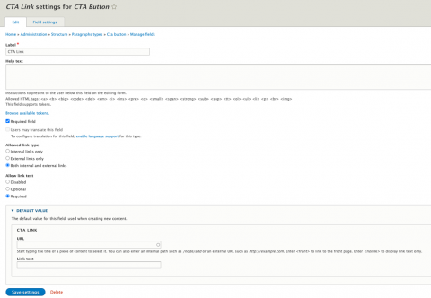
First, we’ll create the paragraph type, in this case named CTA Button, and add two fields: a Link field (cta_link) and a List (text) field (cta_icon).

On the link field, require a title, this will be our button text.

CTA Button link field creation


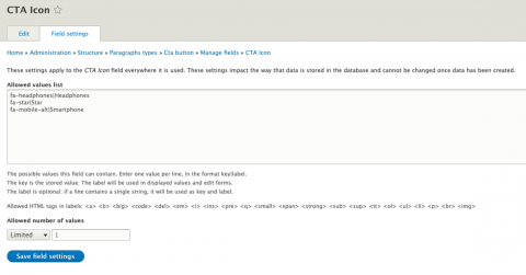
Next, we’ll add some options to the allowed values list of the list field. The first part is the key, this is what will be printed in our Twig template and the value should correspond to the unique class of the Font Awesome icon we wish to display. The second part, after the pipe, is a descriptive label for what the user will see on their list of options when using the component.

CTA Button list field values


Note: List field values cannot be removed or changed once created, so be careful when adding new values. You can, however, add new list items later on, which makes this method ideal for when a client or user needs to be able to add more icon options on their own without developer time or input. 

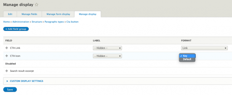
Finally, on the icon field display settings, set the Format to “Key”. This is the secret sauce that makes this particular approach work.

CTA Button list field display settings


After our fields are created and configured, we’ll create a Twig template override for the paragraph, paragraph--cta-button.html.twig, from a copy of paragraph.html.twig, the content of which will look like this:

{%
  set classes = [
    'paragraph',
    'paragraph--type--' ~ paragraph.bundle|clean_class,
    view_mode ? 'paragraph--view-mode--' ~ view_mode|clean_class,
    not paragraph.isPublished() ? 'paragraph--unpublished'
  ]
%}
{% block paragraph %}
  <div{{ attributes.addClass(classes) }}>
    {% block content %}
      <a class="button" href="{{ content.cta_link.0['#url'] }}">
        {% if content.field_cta_icon|render %}
          <i class="fas {{ content.field_cta_icon.0 }}" aria-hidden="true"></i> 
        {% endif %}
        {{ content.cta_link.0['#title'] }}
      </a>      
    {% endblock %}
  </div>
{% endblock paragraph %}

The markup above will utilize the key from our icon field to display the Font Awesome icon selected by the content editor on the button, just before the button text.

Just like that, we're done! You can now style it as you see fit and this button paragraph can be used on its own or as a sub-component in another entity. Let's take a look at the finished product:

Button with a Font Awesome icon

Closing thoughts

Another benefit to this approach is that we’re not just limited to paragraph types here, this method can also be used in custom blocks and field groups to fit your particular use case.

I hope you found this example useful, as it is illustrative of how Drupal 8’s built in core functionality can be leveraged alongside contributed modules to ease the content creation and layout process for content editors while simultaneously saving developer time.