
Grid systems, along with fluid layouts, are all the rage today. Because of the recent increase in device screen sizes due to mobile platforms, fixed-width layouts make less and less sense. However, 100% of fluid layouts aren’t the best choice in all situations. I’m going to be bold and state that content should always determine the layout. You should never find yourself trying to fit your content into your layout. Consider the following illustration:
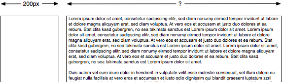
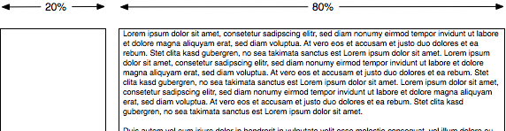
In this illustration, the content on the left displays best when given a 200px width. This would not be possible in a fluid layout, as it would require this region to have a percentage based width, like this:
The correct solution in this example, in my opinion, is to let the content on the left be 200px wide and the rest of the content fill the rest of the screen.
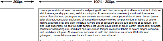
This is a bit tricky in CSS, as the left side content will need to be position absolute, and the content on the right be given margin-left 200px plus any gutter. But since the content in this instance demands a particular width, the correct decision should be to forgo a grid system and write our own layout. Do you agree? Ever run into something like this? What was your solution?